z-spot
Description
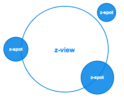
By default this component allows to zoom-in to a new view. In other words is a zoomable component to go to another view. Inside a z-spot you can nest other z-spot. Currently, z-list is not available for z-spot
Zoom-in to a new view
By default, z-spot is made to perform a zoom transition to another view. You need to use the property to-view indicating the name of the view you want to go. Also, is it possible to pass params that work with or without vue-router.
If you want to point a view to go, simply use to-view as string with the view name (it is not case sensitive). In case, you need to pass some params it is necesary to use an object in to-view as follows:
to-view: "{
	name: 'device',
	params: {
		key: value,
		key: value
	}
}"
Then, in the target view device you can retrieve those params using $zircle.getParams() or $route.params if you use vue-router.
Using programmatic navigation
In certain occasions you may need to perfom a programmatic navigation to zoom-in to a new view. Something similiar to vue-router programmatic navigation
Since zircle-ui v.1.1.0 it's possible thanks to toView action (a sintax sugar of setView).
Regarding its usage you have two possible options. One, you can point the name of your defined view. In those cases the next view will appear in the center of the screen, because it doesn't have an initial z-spot to take the starting position as reference.
export default {
  /* ... */
    this.$zircle.toView('home')
  /* ... */
}
Two, in case you want a new view appears from a specific z-spot position you'll need to define an object as follows:
export default {
  /* ... */
    this.$zircle.toView({
      to: 'name of the new view' // string. Required,
      fromSpot: reference-of-the-z-spot // Vue [**ref / $refs**](https://vuejs.org/v2/api/#ref), Required
      params: { your params } // object. Optional
    })
  /* ... */
}
- to is the name a the new view you want to navigate. You need to write the name of your defined view (e.g: 'home').
- fromSpot is the reference of the
z-spotfrom which the new view will appear. To obtain thez-spotposition reference you should use Vue ref / $refs.
For instance:
<template>
	<z-view>
		<z-spot slot="extension" ref="about" />
	</z-view>
</template>
<script>
export default {
  /* ... */
    this.$zircle.toView({
      to: 'about',
      fromSpot: this.$refs.about
    })
  /* ... */
}
</script>
- params are optional. In case you want to pass params along with the new view, you should obtain them from the
z-spotfrom which the new view will appear. In this specific case you can create a new attribute (e.g: colors) and then call it with $attrs.
For instance:
<template>
	<z-view>
		<z-spot slot="extension" ref="about" colors="{white: '#ffffff', black: '#000000'}"/>
	</z-view>
</template>
<script>
export default {
  /* ... */
    this.$zircle.toView({
      to: 'about',
      fromSpot: this.$refs.about,
      params: this.$refs.about.$attrs.colors
    })
  /* ... */
}
</script>
Positioning
z-spot is positionated according its parent component (a z-viewor a z-spot). Having that in mind, you need to use two properties: angle and distance.
To specify an angle, put any value between 0 and 360 degrees (degree could also be a negative number). See the diagram provided.
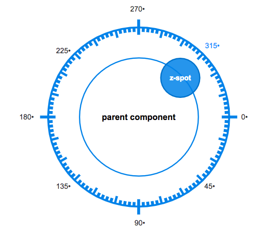
The distance is a numeric value that represent the percentage of distance from the parent component. By default the z-spot has the 100% of distance. This means that the center of the z-spot is placed exactly in the tangent of the parent component.
Modifying the size
By default the diameter of the z-spot is medium. To change it, simply use the property size with any of the following values:
xxl,xl,lorlarge,mormedium,sorsmall,xs,xxs
z-spot as button
This component can mutate its default behaviour to run as button. To enabled it set the property button as true.
In addition, you should add a vue event when button is pressed.
z-spot as knob
As happens with button, z-spot can be a knob. As its name suggests this component displays an interactive circular progress bar with a circular handler. Usefull to create controls like volume, dimmers, etc.
To enabled it set the property knob as true and provide its initial value using the property :qty.sync. By default the z-knob has a range of 0-100 and show the current value in its label.
<z-spot
	knob
	:qty.sync="knobValue" >
</z-spot>
...
data () {
	return {
	  knobValue: 78
	}
}
...
You may need to customize the knob values: range values, unit displayed and where to show the current value. In that case, you can pass an object.
Here you have to pay atention at v-bind.sync which is a vue property that allows us to pass and object using two-ways communication.
As Vue indicates you can't use v-bind.sync with a literal object, such as v-bind.sync=”{ qty: 24, unit: '˚C', min: 18, max: 32 }”, you need to use an object data.
<z-spot
	knob
	v-bind.sync= "temperature" >
</z-spot>
...
data () {
	return {
	  temperature: {qty: 24, unit: '˚C', min: 18, max: 32}
	}
}
...
- qty pass a numerical value
- unit pass a string with the unit format
- min set the min value range
- max set the max value range
- pos positionate the knob label
insidethe z-spot container oroutsideit
See this codepen:
Organize your content
As happens with z-view, in a z-spot you can place different kind of contents. However media is not available.
slot.default
Tipically, the content you put inside a z-spot will be catched by a default Vue slot. In case the content is larger than the view container, it will be hidden.
slot.extension
This slot allows to nest other zircle-ui components. If you want to add just one element add the slot name in the element. In case you need to add more elementes, you can create a wrap element with the slot name.
property imagePath
In case you want to add an image background z-view offers two options: the slot.image or the property imagePath.
property.label
Finally, it is possible to add a label to z-spot that could be positionated in the top, left, right or botton of the z-spot. When you use the property label the default position is the bottom of the z-spot.
property.labelPos
If you want put the label in a different place, use the property labelPos with your prefered value: 'top', 'left', 'bottom', 'right'
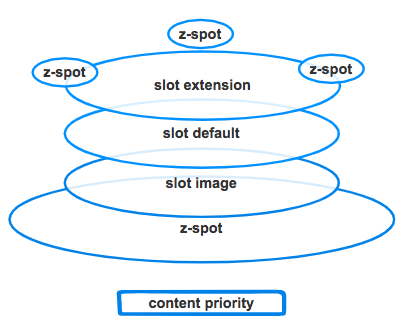
Content layers
OYou can see a diagram that shows how the content is placed. The slot.image is on the bottom, then the slot.default, and the slot.extension.
Slider
z-spot has a child component named z-slider that allow to show a circular progress bar around its perimeter. You need to set true the property slider and use the property progress with a value.
Caveats
Currently,
z-spotdoesn't haveslot.mediaso is not possible to add rich media (however you can put rich media usingslot.default).Also, if the content is larger than the
z-spotcontainer, it won't be scrollable.Finally, you can't nest a
z-listcomponent inside az-spot.The idea behind
z-spotis that it should be a component to perform a transition to another view that by design doesn't have any of the above caveats. Having said that, all this limitations may be overcome in further releases.
TIP
z-spot is the viewport of the next view. So, when you design a view and include a z-spot maybe is good to provide some hints of what it will see next.
Usage
<z-spot
  :angle="45"
  :distance="140"
  size="large"
  to-view="bar">
</z-spot>
Props
| Prop | Type | Default value | Required | Description |
|---|---|---|---|---|
toView | String, Object | undefined | False | This works as a link. When refered to a view (e.g: 'home') it zooms to home's view. If the view is not found a '404 view' will be generated. |
distance | Number | 100 | False | Is the distance from the center of the z-view. 100 means 100%. |
angle | Number | 0 | False | Is the angle of the z-scale. Accepts any number value positive or negative (ej: 345, -567) |
size | String | small | False | Represent the diameter of the z-scalecomponent. Values: 'large', 'medium', 'small', 'extrasmall' |
imagePath | String | primary | False | Use this mixin to provide a path to an image. |
label | String | primary | False | This mixin provides a label which is situated at the bottom of the view. |
knob | Boolean | False | No | When it is true a range knob is shown. |
qty.sync | Number | 0 | No | Qty works when knob is enabled giving its initial value |
v-bind.sync | Object | No | v-bind.sync enable a “two-way binding” for knob passing a defined object with this properties: qty, unit, max, min, pos. | |
slider | Boolean | False | No | When it is true a circular slider is shown. |
progress | Number | 0 | No | progress works when slider is enabled giving its initial value. |
Slots
| Slot | Description |
|---|---|
default | Default Vue Slot. It is used to put any kind of content such as text, icons, etc. |
extension | It is used when you nest other z-spot components. |