z-view
TIP
I'm currently working on Zumly, which is a step forward to create zoomable web apps. You can be one of the first to try Zumly by joining our mailing list!!
More information at zumly.org
Description
This component is the main element of a view. Only one z-view is allowed per view.
Inside it you can nest many others components, such as: z-spot, z-list or z-dialog
Modify the size of z-view
By default the diameter of the z-view is xxl which is the largest size that zircle-ui provides. To change it, simply use the property size with any of the following values:
xl,lorlarge,mormedium,sorsmall,xs,xxs
Note that zircle-ui is responsive so, the diameter changes according the width of the browser's viewport when the app is in full mode. In mixed mode the diameter changes according the width of the canvas.
Organize your content
In a z-view you can add different kind of contents, such as: text, forms, images, graphs, videos, etc. To organize them z-view provides a bunch of slots and properties.
slot.default
Tipically, the content you put inside a z-view will be catched by a default Vue slot. In case the content is larger than the view container, a circular scroll is activated.
slot.extension
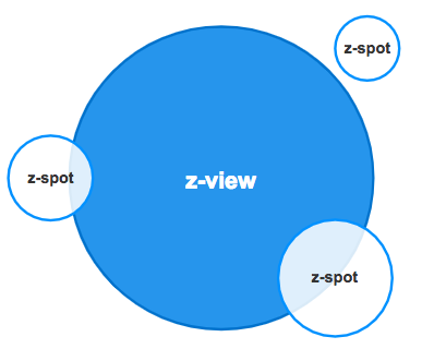
This slot allows to nest other zircle-ui components. If you want to add just one element add the slot name in the element. In case you need to add more elemntes, you can create a wrap element with the slot name.
<!-- Nest a single component -->
<z-view>
	<z-spot slot="extension">
	</z-spot>
</z-view>


<!-- or Nest multiple components -->
<z-view>
	<div slot="extension">
		<z-spot></z-spot>
		<z-spot></z-spot>
		<z-spot></z-spot>
	</div>
</z-view>
property imagePath
In case you want to add an image background z-view offers two options: the slot.image or the property imagePath.
slot.media
To add rich media content like videos, maps, graphs, etc, you need to them inside the slot.media.
property.label
Finally, it is possible to add a label to z-view that could be positionated in the top, left, right or botton of the z-view. When you use the property label the default position is the bottom of the z-view.
property.labelPos
If you want put the label in a different place, use the property labelPos with your prefered value: top, left, bottom, right
Content layers
On the right you can see a diagram to show how the content is placed. The slot.image is on the bottom, then the slot.default, followed by the slot.media and the slot.extension.

As you may noticed slot.media is over the slot.default, that is intended because rich media content usually needs to be interactive.
In case you want to show both a regular content and a rich media, you should put them all in the slot.default and omit the slot.media
Circular slider
z-view has a child component named z-slider that allow to show a circular progress bar around its perimeter. You need to set true the property sliderand use the property progress with a value.
Usage
<z-view
	slider
	:progress= '45'
	label: 'Home's view'
	label-pos: 'top'
	image-path: '/image.png'
	>
	<!-- Default slot -->
	Hello world!
	<!-- media slot -->
	<iframe slot="media" src="youtube" />
</z-view>
Props
| Prop | Type | Default value | Required | Description |
|---|---|---|---|---|
size | String | 'xxl' | No | Set z-view's diameter. |
label | String | No | Provides a label which is situated at the bottom of the component. | |
label-pos | String | 'bottom' | No | Situates the label at left, right, top or bottom position of z-view |
slider | Boolean | false | No | When it is true a circular progress bar, z-slider, is shown. |
progress | Number | 0 | No | Progress works when z-slider is enabled and gives its initial value. |
imagePath | String | No | To add the path of a background image. |
Slots
| Slot | Description |
|---|---|
default | Default Vue slot. It is used to put any kind of content such as text, icons, etc. If its content is larger than the view container, a circular scrollbar, z-scroll, is activated. |
media | To insert videos, maps or another rich media content. |
extension | To nest zircle-ui components around the z-view. |