z-list
Description
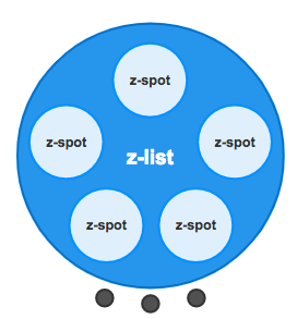
This component manages a list or collection of items. It works only inside z-view component and you need to use with the z-viewslot.extension. In further releases it would be possible to extend z-list to z-spot and z-dialog.
Populate your list
z-listhas a property named items to manage a list of items. The list has to be an array.
Items por page
Thanks to the property perPage you can define how many items are displayed en each page. By default perPage is set to show 5 items.
When the items are more than one page the child component z-list-pagination is activated showing a dot navigation at the botton of the z-list
Customizing items
<z-list> uses scoped slots to customize the template of each item. When you click or touch an item, a new view is called showing its details.
As you maybe have noted, each item is a z-spot so its same properties applies here. However, there is an especial property you need to define: index
Items view
It is possible to define a view to go for each item. To achieve taht you need to use the property toView. This property has the same behavouir that z-spot. Thats means that you can define a view using just a stringor you can pass params using an object.
In the tutorial there are some examples if you want to see it in action:
In case you pass paramszircle-ui allows to catch the params given using $zircle.getParams() in you items view.
Usage
Populate the property items with an array of elements and define how many items per page you want to show using the property per-page.
<template>
  <z-view>
      <z-list
        slot="extension"
        :items="collection"
        :per-page="3">
          <z-spot
            slot-scope="props"
            :index="props.index"
            :to-view="{ name: 'device', params: { fruit: props.category}}">
          </z-spot>
      </z-list>
  </z-view>
</template>
<script>
export default {
  data () {
    return {
      collection: [{name: 'Apple', color: 'red'}, {name: 'Apple1', color: 'green'}, {name: 'Apple2', color: 'yellow'}, {name: 'Apple3', color: 'purple'}]
    }
  }
}
</script>
TIP
To show the details of the selected item you have to create a new view. In this case a view named device. If you don't to it, when you click to see the items details an internal 404 view will appear.
const device = {
  template: `<z-view>
  {{ item }}
  </z-view>`,
  data () {
    return {
      item: this.$zircle.getParams().fruit
    }
  }
}
Props
| Prop | Type | Default value | Required | Description |
|---|---|---|---|---|
collection | Array | undefined | True | An array with items. |
perPage | Number | 5 | False | The number of items per page. |