Home
Description
Let's begin with the home view, that is the initial view of our app. In this view we are going to show the most relevant options of the dashboard. Each option, that will be represented by a small circle (z-spot) allows us to zoom-in to another view.
Code
To start with, go to /src/views folder, open our home.vue file and replace the previous code with the following one:
<template>
  <z-view label="zircle demo" label-pos="bottom">
  11:53 PM
  <br>
  Monday, Oct.
  <br>
  <br>
  <h1>{{scene}}</h1>
  <br>
  Outside 29˚C, sunny
  <br>
  Inside 25˚C
    <div slot="extension">
      <!-- status monitor -->
      <z-spot
        style="background-color: orange; border-width: 4px; border-color: var(--background-color);"
        :angle="-145"
        size="m"
        :distance="120"
        to-view="status">
        <i style="color: var( --accent-text-color)" class="fas fa-bell"></i><br>
        <span style="color: var( --accent-text-color)">15</span>
      </z-spot>
      <!-- family-->
      <z-spot
        :angle="-30"
        size="s"
        :distance="120"
        label="family"
        label-pos="top"
        to-view="maps">
        <i class="fas fa-map-marker-alt"></i>
      </z-spot>
      <!-- scenes-->
      <z-spot
        :angle="0"
        size="s"
        :distance="120"
        label="scenes"
        label-pos="right"
        to-view="scenes">
        4
      </z-spot>
      <!-- rooms-->
      <z-spot
        :angle="30"
        size="s"
        :distance="120"
        label="Rooms"
        label-pos="right"
        to-view="rooms">
        5
      </z-spot>
      <!-- devices-->
      <z-spot
        :angle="60"
        :distance="120"
        size="s"
        label="Devices"
        label-pos="right"
        to-view="devices">
        45
      </z-spot>
      <!-- settings-->
      <z-spot
        :angle="150"
        :distance="120"
        size="s"
        label="Settings"
        to-view="settings">
        <i class="fas fa-sliders-h"></i>
      </z-spot>
    </div>
  </z-view>
</template>
What the code does
As you may noticed the code seems to be verbose and repetitive. That's true. In this view is intended, but in the following views we are going to use v-for to optimize the code.
z-view
Always you define a view you have to use z-view as the main component. This is will be the main circle on the screen.
Label prop: We use the
labelproperty to add a title to the view: "Smart Home Dashboard".Size prop: By design,
z-viewadopts the largest diameter available in zircle-ui. However, depending on your needs you can use the propertysizeand choose any of the possible values:- xxl
- xl
- l or large
- m or medium
- s or small
- xs
- xxs
Default slot: As you see there is some content that appears inside the
z-viewcontainer. This content is catched by a vueslot.default. In this case we put a welcome message with some mocked data: current time, outside and inside temperature and the current active scene. You can learn more about slots on the official Vue documentation.Extension slot: After that, we nest some zircle-ui components in
z-viewusing thez-viewslot.extension. In this case we create a wrapper using adivelement with the slot.extension and inside it we put severalz-spot. In case you have just on zircle-ui component to nest in, you can addslot="extension"in the zircle component. For example:
<z-view>
  <z-spot slot="extension">
  </z-spot>
</z-view>
z-spot
As you see, each z-spot has its own properties: angle, distance, size, to-view, label, label-pos.
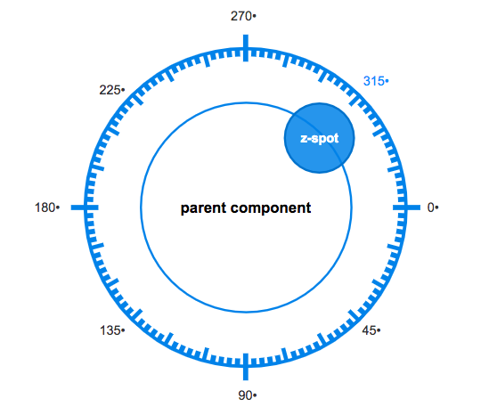
- Angle prop:
angleanddistancetoghether allow us to positionate thez-spot. The angle value could be any number between 0 and 360 (negatives values are accepted too). By default, the angle is '0'. At the begining it may take some effort to understand which angle choose. The following diagram may help you:
Distance prop: The property
distancemeasures the percentaje of distance of the parent component (in this casez-view). All our z-spots have a value of '120'. That it means that the center of thez-spotwill be at 120% of distance of the center ofz-view. If you don't specify the propertydistance, the value by default will be '100'.Size prop:
sizeis another important property. It represents the diameter of thez-spot. As zircle-ui is responsive, we can't specify a numerical value. Instead the values are:- xxl
- xl
- l or large
- m or medium
- s or small
- xs
- xxs
By default, the size of z-spot is medium.
toView prop:
to-viewis the property that allow us to go to another defined view. It is a kind of link. In this view we have defined someto-viewwith the name of views that we are going to create soon. Please take note thatto-viewalso accepts params and and works seamless with vue-router (if you use it). You can learn more aboutto-viewin the documentation.Label prop:
labelallows us to add titles toz-spot. Very usefull if you usez-spotwith small sizes (Equal or lower than medium).LabelPos prop: You can positionate your labels with the
label-posproperty. The options are top, left, bottom (default), right
CSS Styles
In some z-spot we used a style attributte to customize its appearence. Although, you can add whatever css style you desire, there are some very usefull: border-color, background-color and color. You can put the color you want or use the css variables provided by zircle-ui
For other projects you can use a class attributte as well
That's all. Save the home.vue file and check your browser.